New web site
After months of work and even long taking to decide on the design my new web site is now finish (for now).
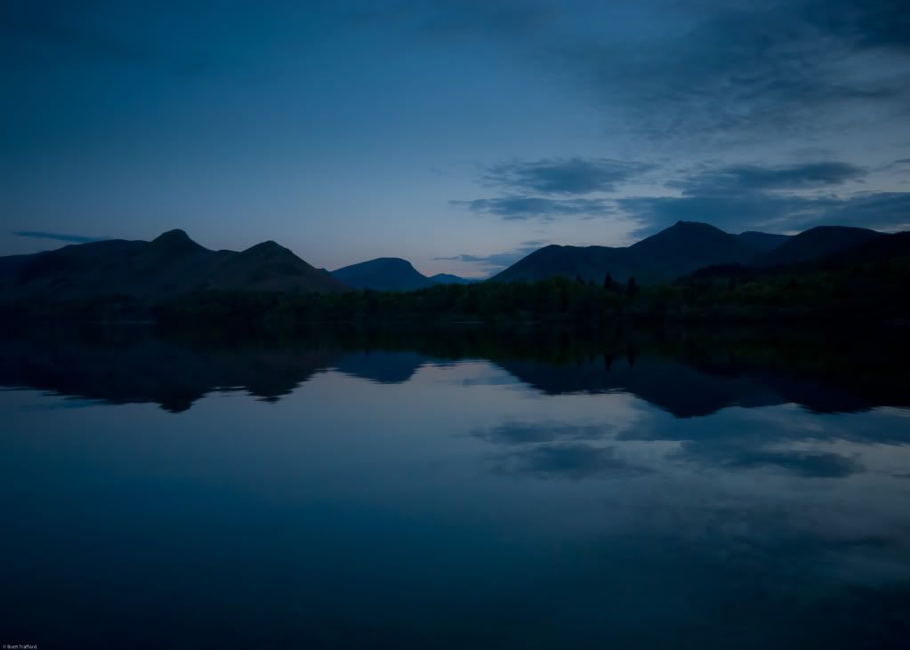
I've taken a completely new direction on the style going a way from the black photo gallery feel to a brighter white look. There's a lot more space for information and loads of links always to hand what ever page your on.
As it is a complete change feed back would be welcome.
----------------
Now playing: Seal - Future Love Paradise [Album Version]/Album Version
via FoxyTunes


Comments
LIKE the panoramic landscape look of the slideshow (till a portrait pic arrives!)
DISLIKE the serif Times New Roman typeface of 'LATEST NEWS etc" alongside the sans serif (Century Gothic?). The serif just looks dated and clumsy - maybe it's just the typophile in me! Stick to one family of fonts (and use bold, italic, caps etc etc). It looks more uniform.
LIKE the 100% (percentage) spinning graphic while the site loads!
LIKE the wedding 'test drive' offer - that's inspired!
LIKE your narcissism!I love your quote!
And finally - it's just me, but I preferred the black background :-)
GREAT WORK!